Pain is complex.
Communicating pain is even more complicated. According to 2016 U.S. Census data, one in five Americans speaks a language other than English at home, and 40% of them speak English less than very well which means that they have language barrie in everyday communication in the U.S. A language barrier in healthcare negatively affects social and racial disparities, patient-provider communication, health literac and self-agency of patients.
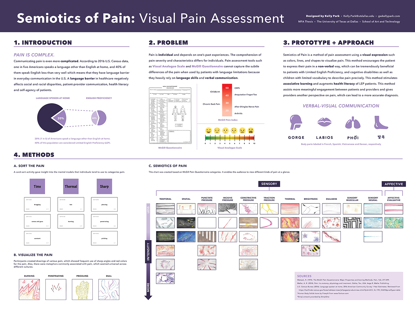
Process Poster presented at 2018 Sackler Student Symposium, 2018 Information Architecture Summit, and 2018 Innovation and Technology Summit (1st Place Winner for Best Poster).
Name the Pain
To see if my pain visualizations make sense. I asked other individuals to guess my semiotics. Plus, I conducted another card sorting workshop online.
View Name the Pain questionnaire.

Visualizing Pain
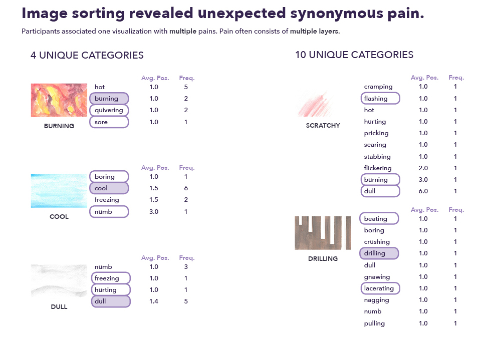
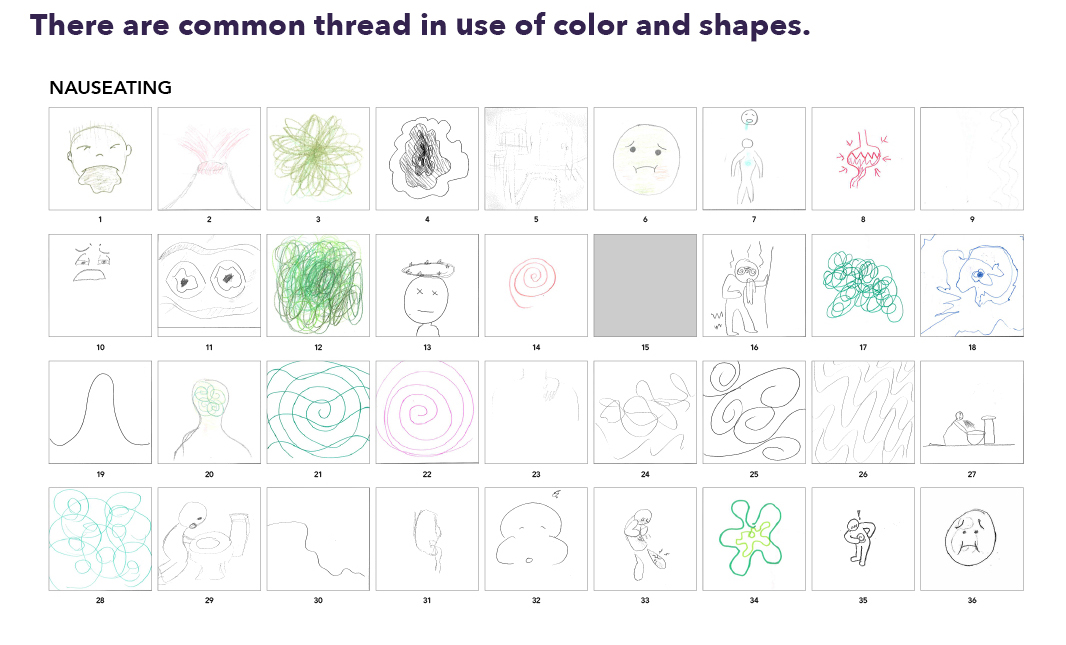
The purpose of Visualizing Pain questionnaire is to find out how people perceive and visualize pain differently. More than 50 individuals filled out the questionnaire, and I compiled visualization of each pain to discover common metaphors and visual elements.
View full questionnaire.


Visual Pain Lexicon
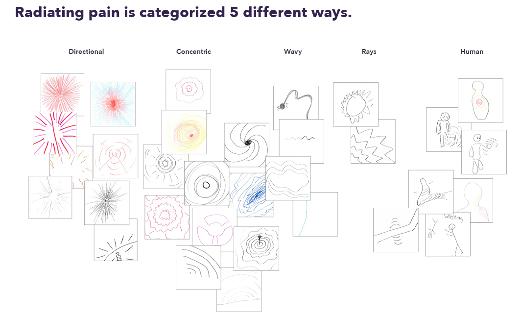
I have asked more than 50 individuals to visualize 38 different kinds of pain and compiled visualizations to create Visual Pain Lexicon.
Rethinking the accessibility of prescription bottle.
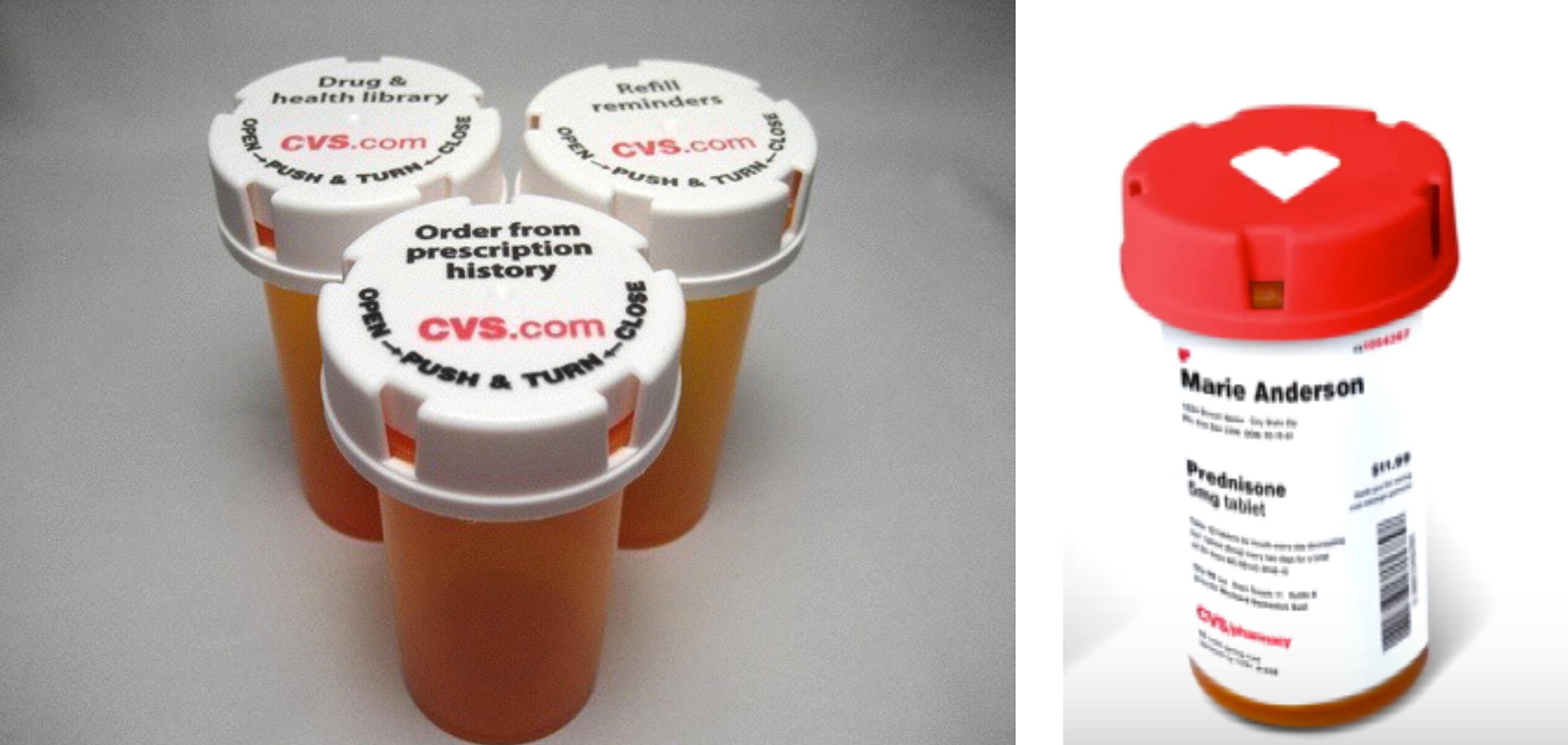
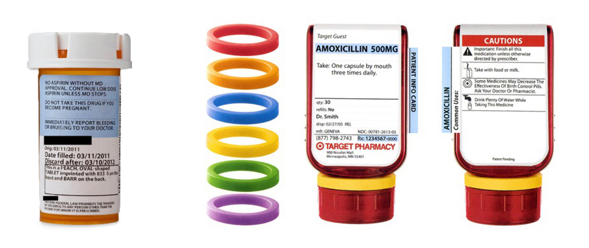
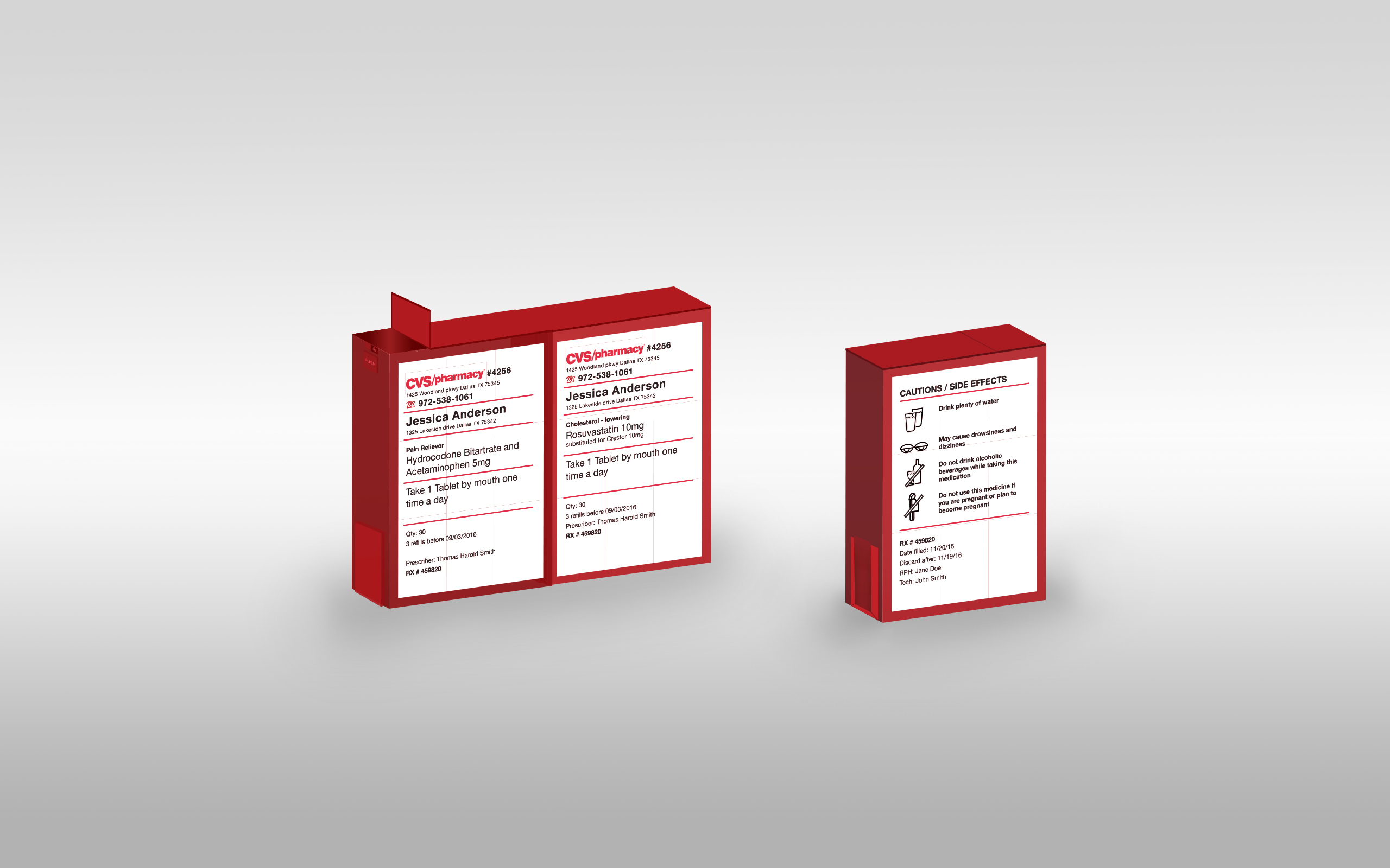
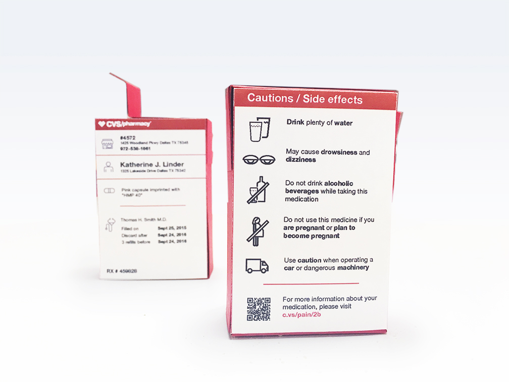
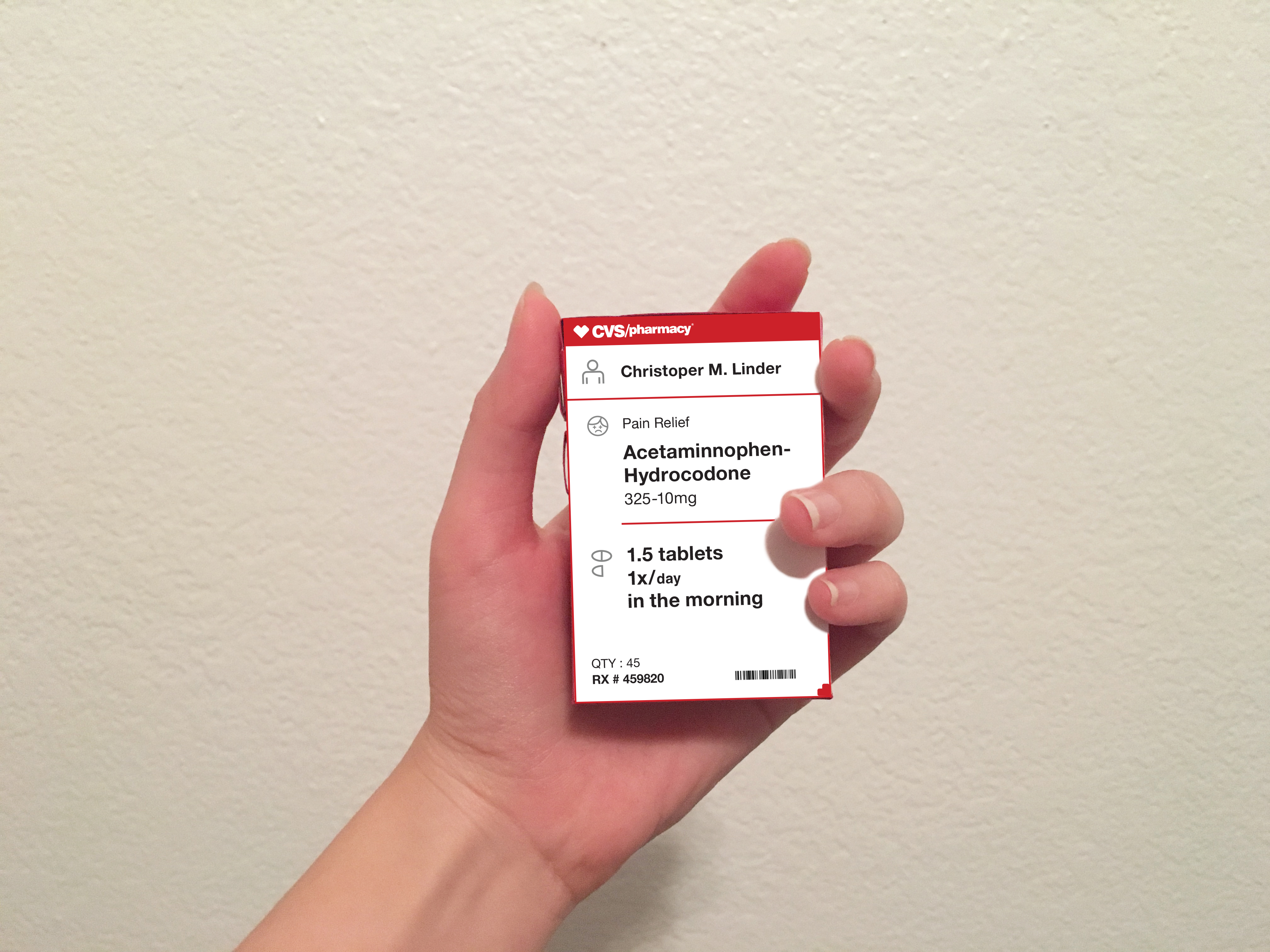
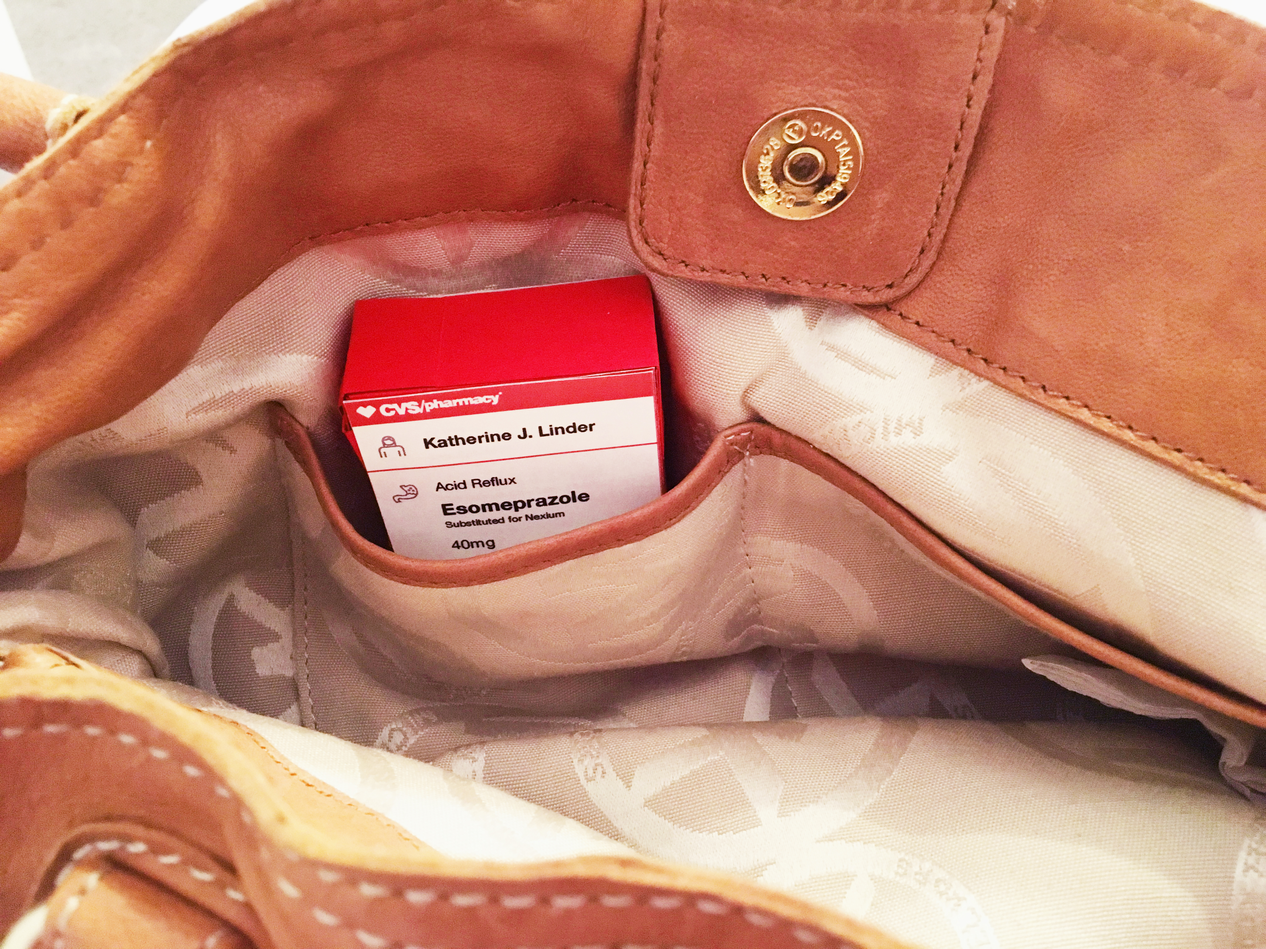
To enhance brand awareness, increase user accessibility and minimize confusion, we designed a new rectangular prescription pill bottle for CVS. With new key features like icons, modularity, and everyday language, new CVS prescription bottle is easier to understand, open and store.
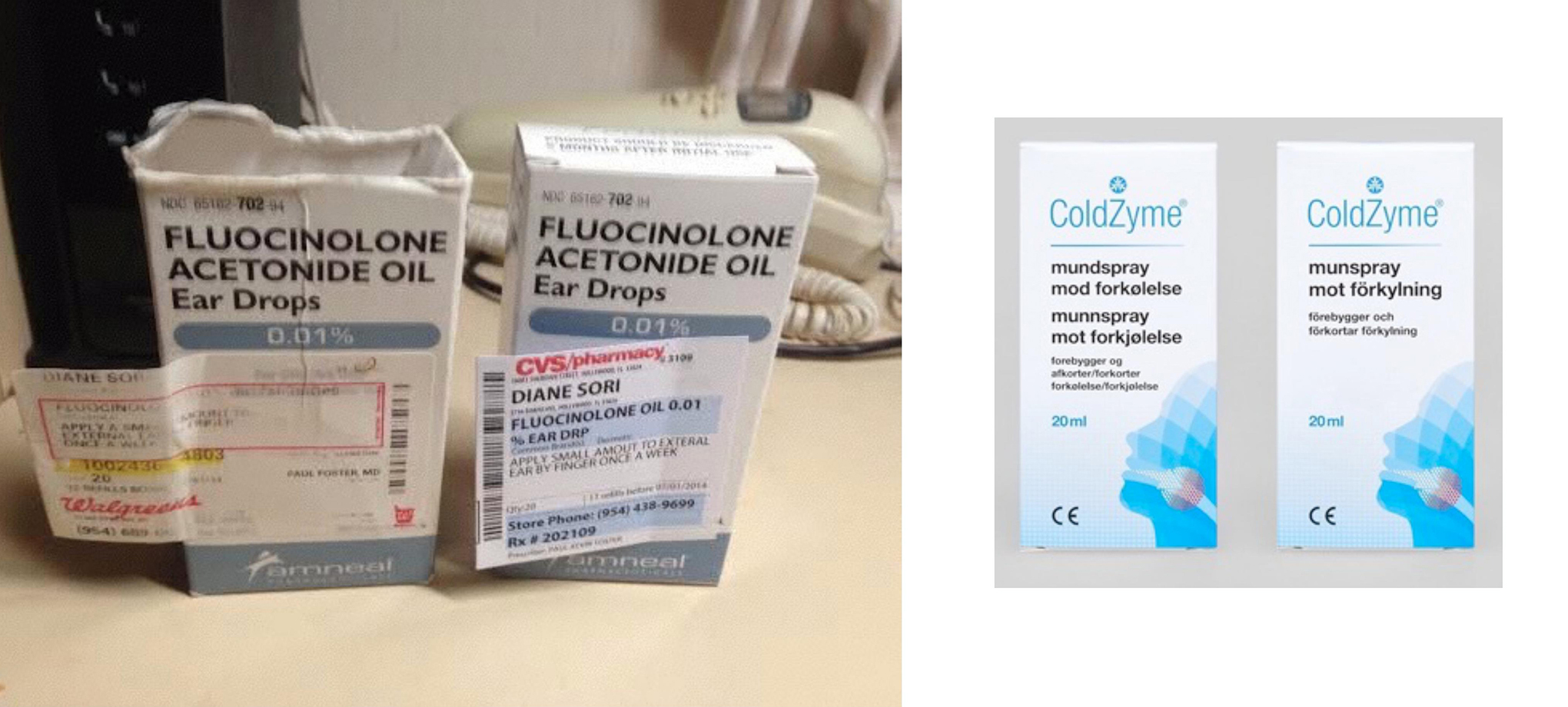
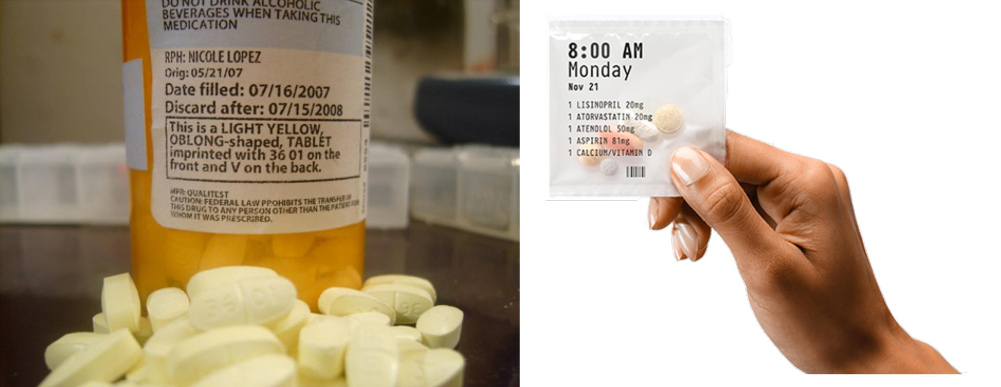
Based on design principles, we identified the pain points of the prescription bottle and redesigned it.
Pain points
-
Accessibility: Push-and-turn cap is not ideal for elder consumers and consumers with arthritis condition.
How can we design a pill bottle that is accessible yet safe?
![]()
- Aesthetic-Usability Effect: Pill bottle design is not aesthetically pleasing or distinctive. Aesthetic designs are perceived as easier to use than less-aesthetic designs.
![]()
- Color: Colors used in CVS Pill bottle are not on brand or effective.
![]()
- Hierarchy: Lack of hierarchy confuses consumers.
![]()
- Iconic Representation: Iconic representation can quickly and more effectively convey meanings, but current pill bottle does not utilize any icons.
![]()
- Legibility: Typeface, text style, sizes, and weight vary without a clear system. This lowers legibility and the effective delivery of the message.
![]()
- Readability: A cylindrical shape of the bottle limits the user to read the whole text at once.
![]()
Objectives
• A label that is easily understood at a glance, minimizing confusion.
• Create sympathy in the user by adding delight.
• Create an experience that is accessible for all ages and conditions.
Research Process
Competitive Analysis
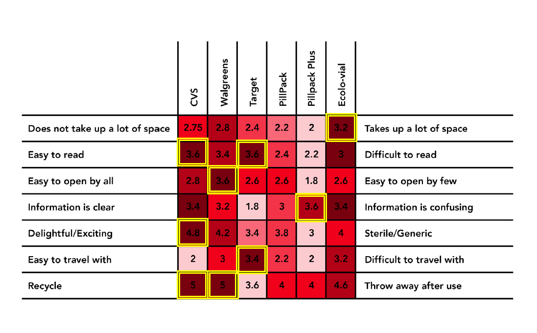
We studied both personal and impersonal traits of the pill bottles. We compared these traits to CVS’s product as well as the competitor’s products. CVS had the worst ratings in 3 categories. Our competitor PillPack Plus had the most positive ratings.

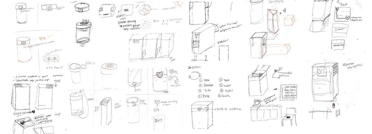
Sketching
Prototyping
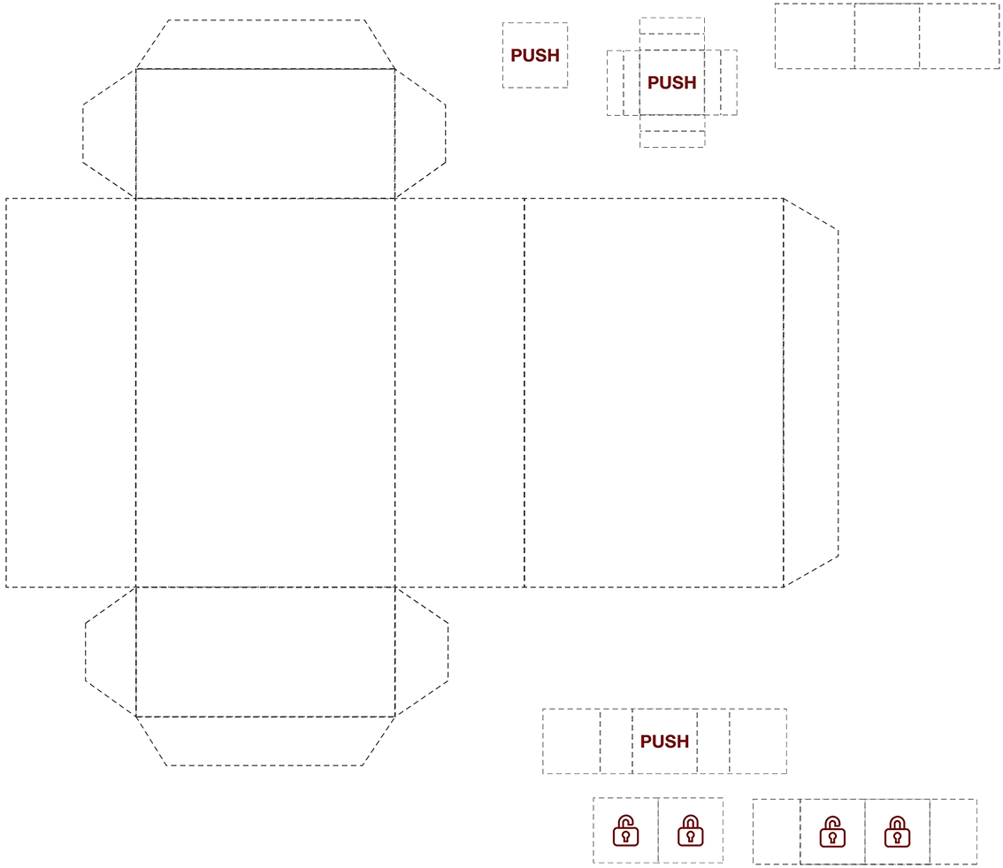
From digital to physical.
Key Features
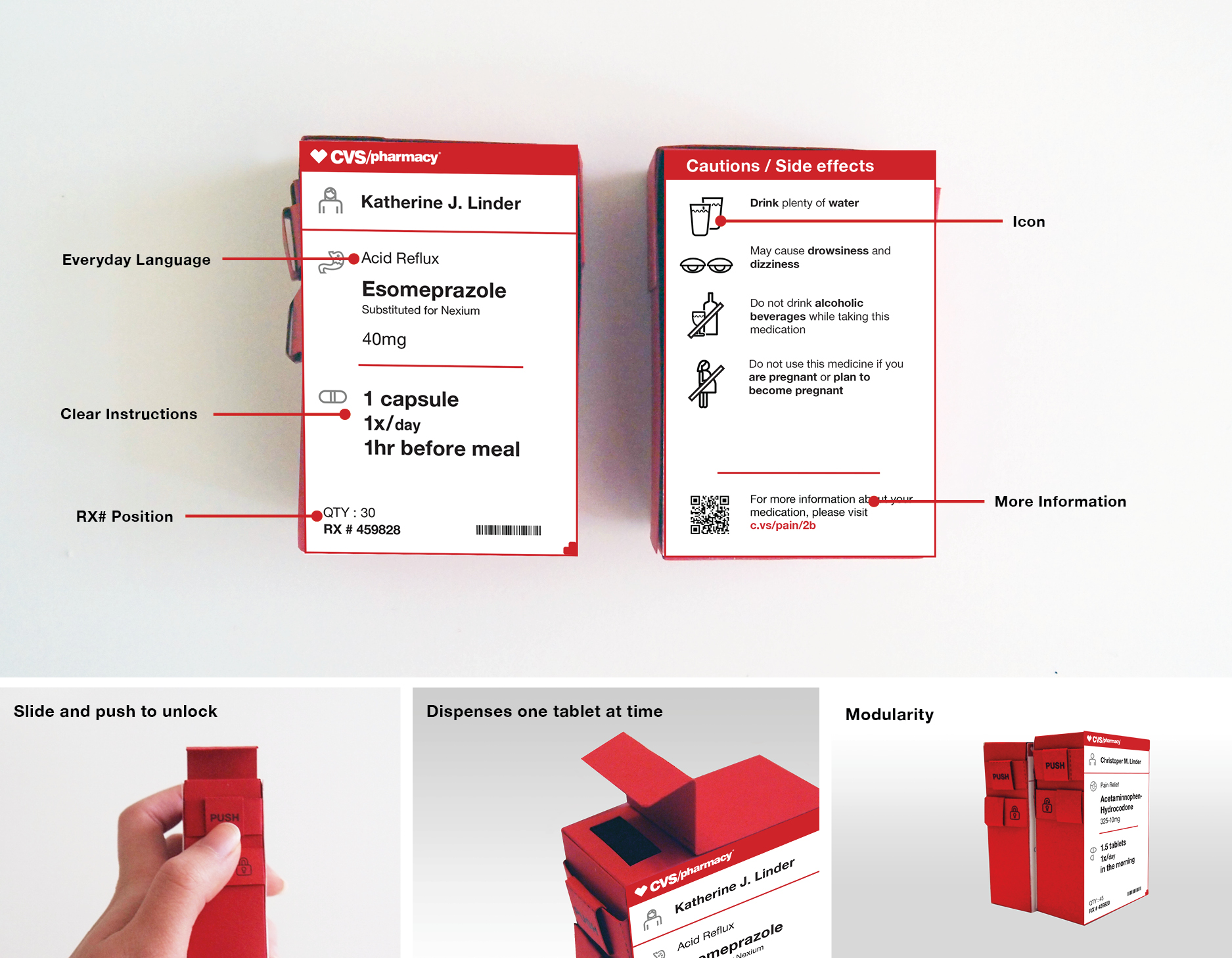
My Role: Designer + Researcher
Team Members: Kelly Park & Angela Kou
REVEAL
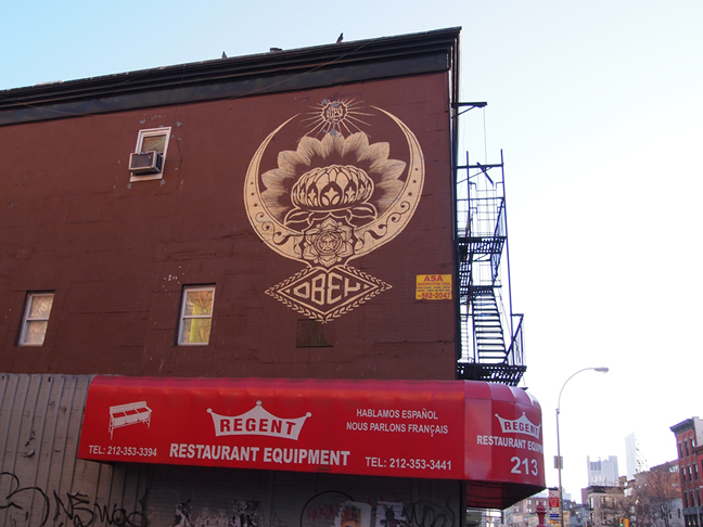
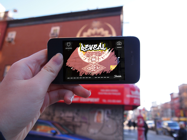
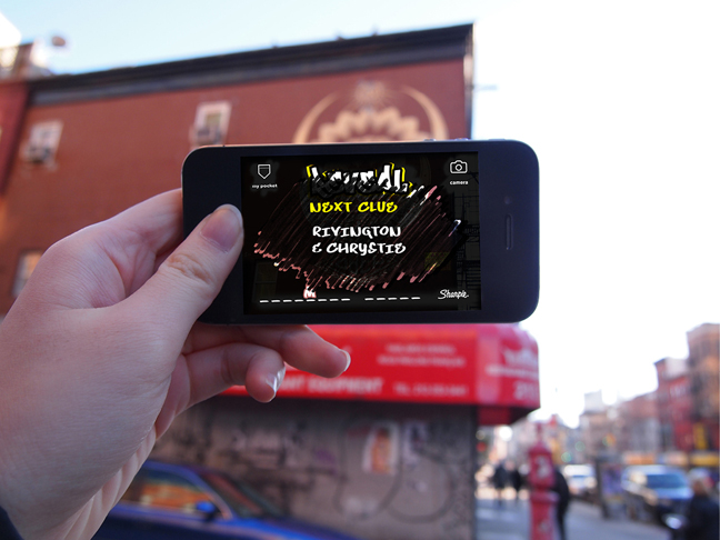
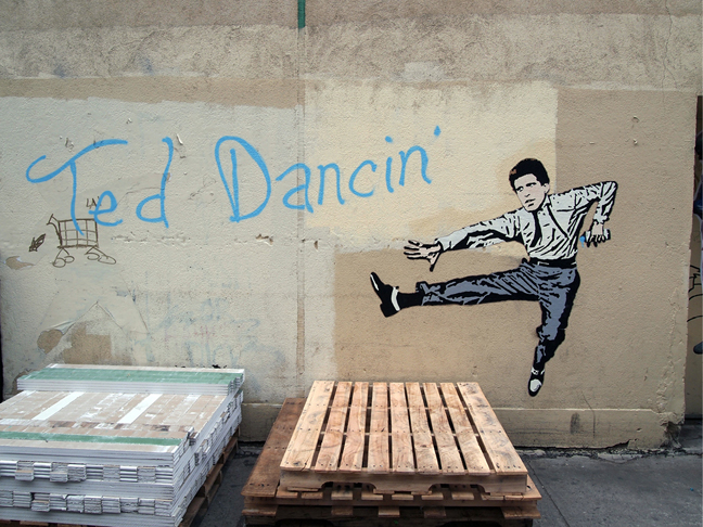
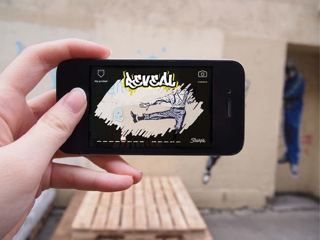
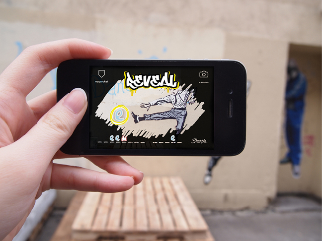
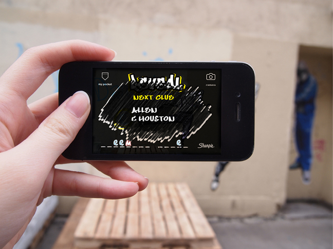
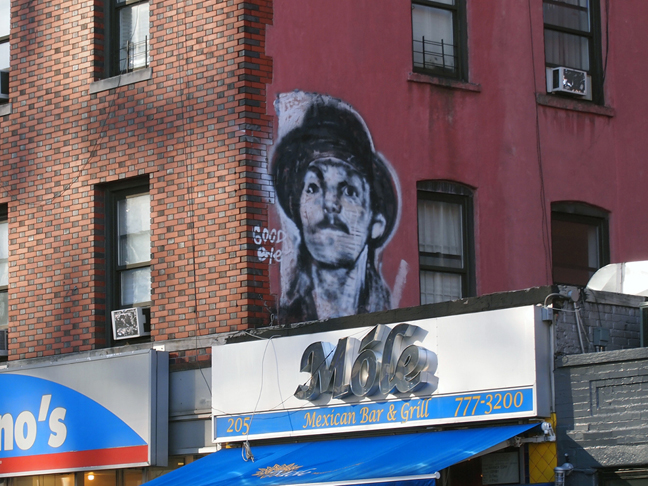
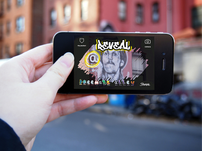
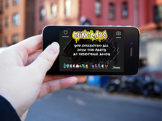
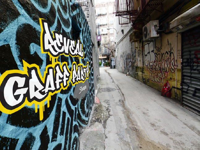
Reveal is an augmented reality game that you play by finding hidden letters on graffiti throughout New York City . By collecting all the letters, you can enter the graffiti party sponsored by Sharpie.
